The Art of Color: Creating Impactful Designs with Photography Hues
Color plays a crucial role in design, and when it comes to incorporating photography into your space, the hues you choose can significantly impact a room’s mood, aesthetic, and overall harmony. Whether working with bright, bold colors or soft, muted tones, understanding how to use photography hues strategically can transform any space into an impactful visual experience.
Choose Colors that Set the Mood
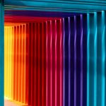
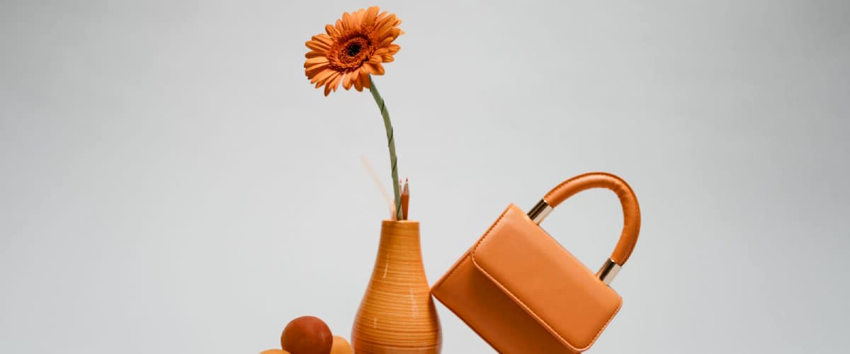
When selecting photographs for your space, consider the mood you want to evoke. Different colors can bring different emotional responses. For instance, blue hues are often associated with calmness and tranquility, making them ideal for bedrooms or relaxing spaces. On the other hand, warm colors like reds, oranges, and yellows can create a sense of energy and vibrancy, perfect for living rooms or areas where you entertain guests. Using photographs with the right colors allows you to craft the desired atmosphere for any room.
Create Contrast and Depth
One of the most powerful ways to use color in photography is to create contrast and depth in your design. Photos that feature contrasting colors—such as a bold red against a monochromatic backdrop—can become a focal point and add a dramatic flair to a room. You can also use complementary colors to create balance and harmony; pairing a green-toned photograph with a room with red accents will make both colors stand out more vividly. Additionally, photos that play with light and shadow can bring depth to flat spaces, giving them a multi-dimensional feel.
Coordinate with Existing Color Schemes
To create a cohesive and harmonious design:
- Ensure that the colors in your photographs coordinate with the existing color schemes in your space.
- Choose photographs with neutral tones or monochromatic palettes that blend seamlessly with your decor for a more minimalist look. If your space is filled with bold colors, select pictures that feature these hues to tie the design elements together.
- Remember, photography doesn’t have to match perfectly; instead, it should complement and enhance the room’s overall aesthetic.
Photography hues are powerful tools in interior design. They can set the mood, create contrast, and enhance the overall color scheme of a space. By choosing colors that evoke the desired emotions, creating contrast and depth, and coordinating with your existing decor, you can make your interiors visually stunning and uniquely personal.